KONTEKST SVETSKOG SIROMAŠTVA
- jer se malo šta može dobro osmotriti van konteksta u kojem postoji -
Naš je svet u potrazi za novim pardigmama u ekonomiji, finansijama, međunarodnim odnosima, slobodama, u potrazi za novim paradigmama svetskog razvoju u celini.
Kontekst našeg sveta je paradoks da svet nikada nije bio toliko otvoren, toliko dostupan po informacijama o tome ŠTA se, GDE i KOME događa, a istovremeno nikada u njemu nije bilo više teskoba i neizvesnosti, sasvim uzanih i zatvorenih prostora koji zamračuju i preprečuju, poput paukove mreže, svu tu celu osvojenu otvorenost i "mrežu" koja je napravljena internetom i brzim komunikacijama.
Šta USTVARI znači "svetska nejednakost u zaradama, ŠTA je svetski pojam SIROMAŠTVA, ako ga ima?"
 Branko Milanović u svojoj knjizi "The Haves and Have-Nots", uz mnoge druge zanimljive prikaze, napravio je i grafički prikaz za nekoliko zemalja, uporedo i na jednom grafiku koji, bolje nego stotine stranica bilo kakvog opisnog teksta, daje kontekst svetskog siromaštva, daje podatke o tome KO, KOLIKO, a bogami i ZAŠTO je - siromašan.
"The graph shows inequality within a country, in the context of inequality around the world. It can take a few minutes to get your bearings with this chart, but trust me, it’s worth it.
Here the population of each country is divided into 20 equally-sized income groups, ranked by their household per-capita income. These are called “ventiles,” as you can see on the horizontal axis, and each “ventile” translates to a cluster of five percentiles.
The household income numbers are all converted into international dollars adjusted for equal purchasing power, since the cost of goods varies from country to country. In other words, the chart adjusts for the cost of living in different countries, so we are looking at consistent living standards worldwide.
Now on the vertical axis, you can see where any given ventile from any country falls when compared to the entire population of the world.
For example, trace the line for Brazil, a country with extreme income inequality.
Brazil’s bottom ventile — that is, the poorest 5 percent of the Brazilian population, shown as the left-most point on the line — is about as poor as anyone in the entire world, registering a percentile in the single digits when compared to the income distribution worldwide. Meanwhile, Brazil also has some of the world’s richest, as you can see by how high up on the chart Brazil’s top ventile reaches. In other words, this one country covers a very broad span of income groups.
Now take a look at America.
Notice how the entire line for the United States resides in the top portion of the graph? That’s because the entire country is relatively rich. In fact, America’s bottom ventile is still richer than most of the world: That is, the typical person in the bottom 5 percent of the American income distribution is still richer than 68 percent of the world’s inhabitants.
Now check out the line for India. India’s poorest ventile corresponds with the 4th poorest percentile worldwide. And its richest? The 68th percentile. Yes, that’s right: America’s poorest are, as a group, about as rich as India’s richest.
Kind of blows your mind, right?
Now you might be wondering: How can there be so many people in the world who make less than America’s poorest, many of whom make nothing each year? Remember that were looking at the entire bottom chunk of Americans, some of whom make as much as $6,700; that may be extremely poor by American standards, but that amounts to a relatively good standard of living in India, where about a quarter of the population lives on $1 a day.
As Mr. Brankovic writes:
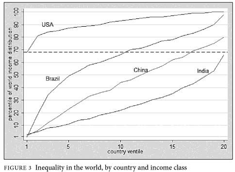
The graph shows that the bottom 5% of Brazilians are among the poorest people in the world but the top 5% are among the richest. Thus the vertical range of the curve tells us about within-country inequality. Comparing between countries we see that the poorest 5% of Americans are among the richest people in the world (richer than nearly 70% of other people in the world). The poorest 5% of Americans, for example, are richer than the richest 5% of Indians.
Ukratko: (s nadom da ništa neće biti "izgubljeno u prevodu")
5% Brazilaca je među najsiromašnijim ljudima sveta, a isti je procenat i među najbogatijima, a poređenje među zemljama pokazuje da je 5% NAJSIROMAŠNIJIH Amerikanaca među NAJBOGATIJIM ljudima na svetu, jer je njih 5% najsiromašnijih bogatije od 5% najbogatijih u Indiji.
O dostupnosti je reč, o mestu rođenja i o činjenici da ne više od 10% ukupne svetske populacije troši i uživa 90% ukupnih svetskih resursa.
Koliko je to, ustvari, održivo uz otvorenost sveta?
Koliko će nam trebati do dogovora o novim paradigmama?
Ne znam, naravno.
Ali znam da prikaze ovakve vrste treba učiniti što dostupnijim...access matters
- jer se malo šta može dobro osmotriti van konteksta u kojem postoji -
Naš je svet u potrazi za novim pardigmama u ekonomiji, finansijama, međunarodnim odnosima, slobodama, u potrazi za novim paradigmama svetskog razvoju u celini.
Kontekst našeg sveta je paradoks da svet nikada nije bio toliko otvoren, toliko dostupan po informacijama o tome ŠTA se, GDE i KOME događa, a istovremeno nikada u njemu nije bilo više teskoba i neizvesnosti, sasvim uzanih i zatvorenih prostora koji zamračuju i preprečuju, poput paukove mreže, svu tu celu osvojenu otvorenost i "mrežu" koja je napravljena internetom i brzim komunikacijama.
Šta USTVARI znači "svetska nejednakost u zaradama, ŠTA je svetski pojam SIROMAŠTVA, ako ga ima?"
The Haves and the Have-Nots: A Brief and Idiosyncratic History of Global Inequality
"The graph shows inequality within a country, in the context of inequality around the world. It can take a few minutes to get your bearings with this chart, but trust me, it’s worth it.
Here the population of each country is divided into 20 equally-sized income groups, ranked by their household per-capita income. These are called “ventiles,” as you can see on the horizontal axis, and each “ventile” translates to a cluster of five percentiles.
The household income numbers are all converted into international dollars adjusted for equal purchasing power, since the cost of goods varies from country to country. In other words, the chart adjusts for the cost of living in different countries, so we are looking at consistent living standards worldwide.
Now on the vertical axis, you can see where any given ventile from any country falls when compared to the entire population of the world.
For example, trace the line for Brazil, a country with extreme income inequality.
Brazil’s bottom ventile — that is, the poorest 5 percent of the Brazilian population, shown as the left-most point on the line — is about as poor as anyone in the entire world, registering a percentile in the single digits when compared to the income distribution worldwide. Meanwhile, Brazil also has some of the world’s richest, as you can see by how high up on the chart Brazil’s top ventile reaches. In other words, this one country covers a very broad span of income groups.
Now take a look at America.
Notice how the entire line for the United States resides in the top portion of the graph? That’s because the entire country is relatively rich. In fact, America’s bottom ventile is still richer than most of the world: That is, the typical person in the bottom 5 percent of the American income distribution is still richer than 68 percent of the world’s inhabitants.
Now check out the line for India. India’s poorest ventile corresponds with the 4th poorest percentile worldwide. And its richest? The 68th percentile. Yes, that’s right: America’s poorest are, as a group, about as rich as India’s richest.
Kind of blows your mind, right?
Now you might be wondering: How can there be so many people in the world who make less than America’s poorest, many of whom make nothing each year? Remember that were looking at the entire bottom chunk of Americans, some of whom make as much as $6,700; that may be extremely poor by American standards, but that amounts to a relatively good standard of living in India, where about a quarter of the population lives on $1 a day.
As Mr. Brankovic writes:
One’s income thus crucially depends on citizenship, which in turn means (in a world of rather low international migration) place of birth. All people born in rich countries thus receive a location premium or a location rent; all those born in poor countries get a location penalty.
It is easy to see that in such a world, most of one’s lifetime income will be determined at birth."

The graph shows that the bottom 5% of Brazilians are among the poorest people in the world but the top 5% are among the richest. Thus the vertical range of the curve tells us about within-country inequality. Comparing between countries we see that the poorest 5% of Americans are among the richest people in the world (richer than nearly 70% of other people in the world). The poorest 5% of Americans, for example, are richer than the richest 5% of Indians.
Ukratko: (s nadom da ništa neće biti "izgubljeno u prevodu")
5% Brazilaca je među najsiromašnijim ljudima sveta, a isti je procenat i među najbogatijima, a poređenje među zemljama pokazuje da je 5% NAJSIROMAŠNIJIH Amerikanaca među NAJBOGATIJIM ljudima na svetu, jer je njih 5% najsiromašnijih bogatije od 5% najbogatijih u Indiji.
O dostupnosti je reč, o mestu rođenja i o činjenici da ne više od 10% ukupne svetske populacije troši i uživa 90% ukupnih svetskih resursa.
Koliko je to, ustvari, održivo uz otvorenost sveta?
Koliko će nam trebati do dogovora o novim paradigmama?
Ne znam, naravno.
Ali znam da prikaze ovakve vrste treba učiniti što dostupnijim...access matters
1 comment:
http://www.youtube.com/watch?v=i4639vev1Rw&feature=related
evo, može i ovako....
Post a Comment